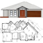
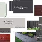
Here are our passive solar house plans. I thought that rather than having links to the detailed designs, it would be nicer to show you selected areas of the house design. Click the images to open a bigger picture.
First up is the site plan. You’ll notice that it’s a weird shape because of the orientation of the block. We want to maximise north-facing areas to take advantage of the sun. However, the front of the house appears parallel to the street, so it doesn’t look unusual from the front. Notably, there’s also a double-brick wall between the master bedroom and the living area, as the architect wanted to add more thermal mass to achieve better solar efficiency.
Next up, the front elevation. I’m finally happy with the revised design. It’s fairly simple. There will be steps leading to the front of the house, and the portico will have a glosswood-lined ceiling. Not sure about the face brick, I think I prefer it all rendered, although I’ve seen some great examples of low-profile face brick used as a feature.
Finally, the floorplan. If I had to change one thing, I’d make everything bigger, but our budget is only so big.
The main features I love about the plan:
1. Large open plan kitchen/living area
2. No bedrooms with common walls.
3. Massive walk-in robe. Looking at the plan at this scale, it really does look rather big!


Pingback: A new page and a new theme | The SP Chronicles
What a unique and interesting house design! Love the angles. Can’t wait to see your build unfold.
Thanks, I can’t wait to get started too! 🙂
Looks great. Lovely big north facing windows to let the winter sun in and what a big WIR. Looking forward to following your build.
Thank you! Hopefully it won’t be too much longer now!
Wow lots of angles. Look forward to see the build progress 🙂
Thanks Leanne, it hopefully won’t be long now!
Wow… that is one stunning house design!!!
Thank you very much, that’s always lovely to hear! 🙂